Monday, April 28, 2008

What I've Learned from Art

This semester has been full of many new and exciting concepts that I have never before thought about when it comes to art. I am quite surprised at how much I have actually been able to learn and retain, since I didn’t expect quite so much being that it is an online class. However, I think taking this online helped me to become my own teacher in a sense, which definitely helps to ingrain the concepts into the mind.

I really enjoyed learning much of the terminology, because it definitely has changed my outlook and perspective regarding all things in life. A simple painting hanging on the wall is now much more complex, since I can point out things such as, media, tones, hues, line types, lighting and so much more. I like the fact that I am now able to speak about a piece of artwork with the comfort of having an actual understanding of terminology necessary to describe the work I am talking about. This class also opened my eyes to the wide variety of art forms that exist. I never really thought too much about natural art forms, such as earthworks and landscapes in the sense of art before this class. However, after learning about them and seeing the Spiral Jetty for the first time, I became intrigued. I would truly enjoy being able to see this and many other earthworks in person, whereas before I might have missed the opportunity to become knowledgeable about such amazing art forms.

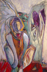
My most memorable experience would definitely have to be my trip to the de Young Museum of San Francisco. It was really nice to see actual paintings, sculptures and other art forms in person, rather than simply from the text. Although I traveled to many wonderful museums in Europe this past winter, the de Young visit was an entirely new experience, since I had now learned the terminology that coincides with the artworks that were hanging before my eyes. I had gained a new appreciation for the artworks, through an understanding of the efforts and time that the artist put forth into creating his or her artwork. The variety of art that the museum offered was also a great, since I was able to view several of the art forms that we learned about over the course of the semester. The beauty of the art was not only seen within the confines of the building, but also emerged beyond the doors to the surrounding gardens and landscaping. The ambiance in itself is a work of art.

Overall, I would definitely say this course has been a wonderful journey through my previous knowledge of art and also in gaining a much greater understanding of the world of art. This has been a great opportunity to expand my knowledge of something I have always shared a passion for, but now am able to grasp a greater liking to the subject in its entirety. My love for art has now gone beyond the surface and reached a level that goes beyond what you see, but rather to an admiration to how the piece is created and the message it might be putting forth. Although it was overwhelming at times, I have truly enjoyed these learning units. Thanks for expanding my knowledge of art!

Monday, April 21, 2008

Conceptual Art

What is conceptual art? From the information I have been subjected to, I believe conceptual art is a work in which each viewing is unique and sheds a new light to each set of eyes. The idea of conceptual art is to provoke thought, rather than have an everlasting art form. The focus is more about the journey, rather than the destination or final outcome. This can make conceptual art hard to preserve, since the concept of conceptual art can simply be an experience of the artist with no subject at all.

One specific artwork that caught my attention from this week’s lesson was Variability and Repetition of Similar Forms II, by Nancy Graves. I really liked this work because it provoked thought. Before reading the explanation in the book, I tried to gather my own analysis by simply viewing the photograph. With nothing else to base my analysis on, I thought this had something to do with the walking dead. How each living creature is living day to day, but ultimately every life will come to an end. I believe this is conceptual art, since it can provoke a variety of thoughts depending on the viewer and their background. Once I read the artist’s analysis, I discovered these were camel bones. She presented these to show that despite their illogical form, they still survive.

I really enjoy conceptual art, and probably always have. I enjoy looking at things that entice curiosity; leave a little mystery for the viewers, so we too feel like we are needed for the artwork to survive and thrive. Conceptual art is great in the sense that it is limitless. I feel like it is away to let out one’s inner most thoughts in a manner they see presentable for public eyes. It is almost as if you can compare it to an artist’s diary, or dialogue with themselves that they would like to share with the world and then allow it to be scrutinized, analyzed and judged. Conceptual art has no boundaries, which makes it interesting because you never know what to expect. When it comes to conceptual art, you can only expect the unexpected and I truly enjoy that idea.

Art Visit

My Art Visit took place on March 18, 2008. I traveled to the de Young Museum located in the heart of Golden Gate Park in San Francisco. The location of this Museum is breath taking. It is surrounded by gardens and wonderful architectural structures. The building alone is quite new and modern, since the museum was re-opened in a new facility on October 15, 2005. However, the de Young was originally founded in 1895.

This experience was quite eye-opening, as are most art museum visits. I am lucky enough to have visited a variety of museums in the past, since I have always had a passion for art. Because of this passion, I have known of the difference between viewing art in person versus through a textbook or online. To stand before a canvas that is larger than life is awe-inspiring. It is nearly impossible to imagine the determination and hard work that the artist has put into the canvas to create such a masterpiece. Despite having viewed artwork in museums in Paris and London this past winter, my experience at the de Young was still new to me. Each museum brings with it a distinct feel. A unique collection of paintings set up in a specific manner to bring amazement to the eyes of each visitor. The de Young had a wide range of art forms. From paintings, large and small, to sculptures, stone and glass, there were many things to grasp my attention. The basic walls of the museum were white, as not to distract from the artwork being presented. This contrast made the boldest of paintings jump off the wall, rather than blend in to a colorful backdrop. Next to each piece of art was a small plaque that described the work presented before the viewer’s eyes. On the contrary, art that is presented in a textbook or online is rather small and usually surrounded by a large amount of words, which can be quite distracting. Pictures presented as replicas usually do not do the original piece justice. On the contrary, sometimes the popularity of a work can bring disappointment to the viewer upon seeing the actual artwork in person. This was my experience with the Mona Lisa last winter. All the hype had greatly increased my expectations, but as I stood before it, I was left disappointed. This goes to show that standing before an original art piece brings about a variety of emotions that a small replica simply does not. To view art in person is an amazing experience that should not be taken for granted or be replaced by a quick online tour.

Choosing a favorite work was quite difficult due to the variety of works to choose from. Several pieces caught my eye. For example, I can vividly remember a huge oil painting of a woman laying her head on her arm. She appeared to be in a sort of daydreaming state of mind and the artist emphasized this by using very light pastels to give the painting an almost cloudy effect. This painting was about 5 feet tall, but appeared almost photographic. There was no visible texture or lines as if to show where the strokes of the brush left color upon the canvas. This image was awesome, although I would not call it my favorite. Another work that caught my attention was in a room full of blown glass art forms. Right as I entered the room, the first thing I was a large bowl of fruit. These glass pieces were rather large, but appeared quite realistic in color, shape, and form. I was quite amazed, since I do not know the first thing about creating glass art forms. As you can see, the de Young holds a variety of amazing pieces of art. So, now we’re asked to choose just one? Quite difficult you see. However, I do remember one piece that I stood before for quite awhile, taking in the creativity, thought and time that were shown upon the canvas. This was not the typical piece that I would expect to see in a museum. The artists, William T. Wiley, Robert Hudson, and William Allan, called their piece “A Window on History by George.” It is a fairly recent piece, being created in 1993. The part that made this image like no other, was the variety of Medias and textures that came together to create on cohesive piece of art. These artists used pastel, contè crayon, charcoal, graphite, and acrylic on a single canvas. I had never seen anything like it in any other museum. Its uniqueness is what put it above the others. There were areas of black and white, from the graphite and charcoal, surrounded by vivid, bright colors. Captured in a single image were most of the terms we had learned about thus far in the class. This single canvas contained areas of representational, abstract, and non objective art. There were contour lines, outlines, vanishing points, overlapping, horizon lines, etc. The list could go on and on. I stood before this image in amazement. For each time I focused on a single area, I saw something new hidden in the canvas. It really was tons of different ideas, beautifully portrayed upon a single canvas. The thoughts and abilities of three men, organized into a single work of art. I still look at the photograph I took of the work and find new amazement in the wide range of ideas, focuses, and materials these men used. These facts alone, makes this a work of beauty like none other. For those reasons alone, I must say this goes down as my favorite work of art I viewed that day, and perhaps my favorite of all works I have seen in my life.

Overall, I would recommend a visit to the de Young museum to people of all ages. Everything about the museum displays the hard work of the individuals that make the museum what it is today, from the artists’ whose work is displayed to the architects who created the structure where these pieces call home. Everything about this museum is astounding. The landscape and building are works of art in themselves. I was blown away, especially since it was a warm, sunny day in San Francisco, which made the scene that much more wonderful. I would say that the more modern pieces definitely attracted me to them more than the older works. However, that has always been my preference when viewing art. All in all, I was pleasantly surprised by my liking to the museum. After visiting museums in Europe this one still grasped my attention, maybe even more so than some I viewed overseas. The size was perfect; enough to give viewers a wide variety of works, while still refraining from becoming overwhelming. If you get the opportunity to spend a day in San Francisco, I would definitely recommend a trip to the de Young museum.

Monday, April 14, 2008

Photographs: Real or Make Believe?

The Before and After:
Click photo to enlarge.

Two Worlds Collide

This is the World's First Camera!!

This week’s topic of photography is quite fun for me. I personally can’t imagine my life without the invention of the camera. I carry my camera in my purse everywhere, just in case I want to capture a moment. I have thousands of photos that allow me to look back through the years quite easily. It is difficult to imagine a world where photographs were rare and hard to come by. It’s something I hadn’t really thought much about, until now. I guess it goes to show how easily things can be taken for granted.

Viewing the artwork of Aziz, Cucher, and Keith Cottingham was very interesting. These images represent the same idea of the distorted body image that the world is compelled to conform to. It’s just so easy, you see it and you want to believe it. You want to become it. If they can, then why can’t I? Well, unfortunately these images aren’t realistic. However, they have men and women, young and old, striving to reach a goal that is impossible. It reminds me of the Barbie theory…it would be impossible for a woman to be proportionally alike to Barbie. She wouldn’t be able to live. So, why is it that distorting images is so widely accepted and prevalent in today’s society?


The Dove campaign is a great cause. Watching that video, although I have seen similar ones too, was very telling of the manipulation and fantasy that comes to life in the realm of photography. This transformation that is brought to life is greatly a result of technology and the advanced abilities of computer photo editing programs. I myself have photo editing programs installed on my computer, which make it so easy to manipulate photographs. It can be quite fun to see the millions of different ways a single image can appear. By simply placing text, manipulating texture or changing the lighting, you can present several different messages with a single picture. So if I can easily manipulate an image, then it goes to show how drastically a professional can change an image. Magazine editors do it every day. “Shave 5 pound off her here, give her an instant tan, change her eye color, etc.” These thoughts are reality, which goes to show why cosmetics and plastic surgery are multi-million dollar industries.
The Dystopia series, by Aziz and Cutcher was extremely mind boggling to me at first glance. Then, after looking into the content I realized that these images present the truth in a manner that is striking and different, but so realistic. If everyone strives to become this perfect image, where is our identity going. Does everyone really want to look the same? How perfect is perfect? It is the individual traits and characteristics that make us unique. Without these, who are we? The editing of the images in this series sends a great message. To erase the facial characteristics that make each person unique, the eyes and the mouth, leaves viewers wondering who the person is. This idea greatly reminds me of the internet.

Today, the internet plays a significant role in nearly everything that individuals do. The internet is like the masks that Aziz and Cutcher have created for the individuals in the images. They have no face, just as with internet communication. We are losing our sense of reality and personal contact and being replaced with the computer screen that billions of individuals sit in front of each day. With technology, comes facelessness, just like the people in the series are subjected to. The more reliant people become on these false ideals and faceless communication, the easier it becomes to give up the right to your own identity. The identity of the person behind the text on your screen is merely an idea, when in reality it could be anyone. Do you want to be the words behind the screen or the face that thought them? Are you willing to give up your identity? I believe this is the most powerful message that is being sent. If we allow such things to rule our lives, we become extinct in a way. We lose our right to self. Is that something you are willing to live without? I personally am NOT. I think the message they are trying to send is that we should love the things we have and embrace them because those "flaws" are what make us, US. I am not saying technology is a bad thing. I love the things it allows. Despite that, it does not need to replace who we are. So next time you strive to look like the girl in the magazine, take a step back and ask yourself what you are willing to sacrifice to become that person, because the steps required to become an imaginary figure will be draining, costly, and never-ending since the end result is a figment of the imagination; someone’s idea of perfection that was so perfectly manipulated with several clicks of the mouse. Do you really want to be the person who lives forever behind the screen or rather, the person who embraces the world and the “flaws” that they were gifted with?

Monday, April 7, 2008

My Favorite Painting


I want to start by saying I found this to be a very difficult task. How can I pick a favorite painting when it is clearly evident that I have not even come close to viewing a fraction of the paintings which have surfaced throughout the world? So this painting is a mere selection of the "favorite painting" amongst those I have been fortunate enough to see in my time here on earth thus far. After viewing hundreds of paintings this was the only one to immediately grasp my attention. The lighting on the water is so dramatic, while the blue hues are incredibly soothing. The irony is that this painter is not well known, in fact, her main focus isn’t even painting. However, it is evident that she has a gift. The artist who created this eye-catching painting is Ann Ulrich Miller. She is the publisher of The Star Beacon and a novelist. She only dabbles in art when she feels urge come over her which inspires her to create a painting. She resides in southeastern Ohio with her husband and their dog. Not the typical idea of an artist who creates masterpieces, but then again, it goes to show that passionate and talented individuals are present throughout the world. Art remains her outlet and passion, not something she does to make a living, which I find to be quite honorable.

As far as the painting is concerned, the title remains simple, Mountains. There is no date posted with the painting, but I am almost certain it is a fairly recent painting due to the information on the site. Ann created this painting with oil, which allowed her to create the wide range of hues, especially the darker hues seen in the sky and plant-life. The use of oil has allowed Ann to achieve the subtle changes in light, creating the realistic three-dimensional effects. In the lighter areas, it is assumed that Ann used a thinning technique to create glazes for the special effects on the water and sky. The thinner helps the paint to appear almost transparent, allowing for the lighting to appear so realistic. The glaze allows the painted objects to reflect light as if they were real. This technique also helped to create the reflection of the trees and plants in the water, which one would see while looking into an actual body of water. I would say the body of water represented in this painting could be classified as an example of trompe l’oeil, due to its realistic qualities. The luxury of oil painting is the slow drying time, since it allows for easy manipulation and error correcting, if necessary. This could factor in to the precision and lifelike qualities that are portrayed in this painting.

Overall, Ann Miller did an amazing job of bringing this painting to life. The lighting is definitely the factor that brought this image into the favorite ranking. Simply looking at the water makes me feel like I am standing on the shore, staring into the glassy, clear blue water. The cool blue hues and the snow capped mountains remind me of winter coming to an end. I feel at peace when viewing this image. It is like an escape from the crazy city life and a calming reminder of the beauty that exists in nature.

Monday, March 31, 2008

Thomas Kinkade..Artist?

Who is Thomas Kinkade? Artist or fraud? Through much reading, I have come to believe there is a great difference between the Thomas Kinkade of the past and the present. The young, inspirational, determined Kinkade of the past should be considered a genuine artist. He took his passion and distributed a book to help others achieve an understanding of his gift. He created original works of art and shared them with galleries throughout California. This allowed for admirers and artists alike to share his passion and talent. This young man, undoubtedly had a gift. However, as we all learn in life, temptations will arise. This is when we see what a person is made of and how strong their will for personal perseverance actually is. Does Kinkade remain true to his passion, or will he succumb to the pressures of profits and greed?

A true artist, I believe would have been more cautious with the idea of becoming a “sell-out,” as I believe the Kinkade of the present is. A true artist would not allow his passion to be replaced with a dollar sign. Kinkade has used his religious conviction to falsely portray his works as something more than they are. He uses Christianity as a way of gaining trust and credibility. He portrays his works and actions as a religious opportunity for investors and buyers. These current works of his really are more of the ideas he once values simply recreated by various means, excluding self creation. Yes, it’s true! He does not have any hands on influence in these works that are being massively distributed to millions of people. The Thomas Kinkade that we know today is a master of manipulation and profitability, rather than a master of art. He had allowed his skill and passion to take a back seat to the fast track to stardom. He seeks profit, rather than a true passion for the arts. This is quite evident by the fact that he stopped selling originals, to “punish” people for taking a disliking to the prints that he was streamlining to millions. When profits declined, he held the true art hostage as if to threaten buyers. This is not the ideals of a true artist and moreover the religious man he has so evidently portrayed himself to be.

The man who I have learned of has become a millionaire through fraud, manipulation, and the mass production of works that have a similar liking to those that he once created himself. By looking at his website, one might be swayed to believe him as a genuine artist who has reached financial success through exhibiting a true passion for the artistic ability that he was gifted with. However, it fails to mention the idea of prints, which is what his money-making scheme has been based upon. Yes, I believe to an extent, print making is a wonderful idea, since it allows for art to reach a wider audience. However, I feel as if Kinkade has tried to hide this major detail in the hopes of making more money. I feel that his passion for art has ceased and been replaced with a decision to become a businessman with a passion for greed.

Sunday, March 2, 2008

Analyze That!!

[Image found on Jessica Manzer blog]

Irises in Monet's Garden by Claude Monet definitely caught my attention. The use of expressive lines gives the image a loose, free feeling which is very realistic to the natural environment being portrayed. The lack of outlines and contour lines allows for this idea that the objects are freely moving, implying a sense of vulnerability to the wind or breeze the may arise on any given day. In this painting, Monet uses many different tints and shades of secondary colors. The cool colors used to depict the irises are very soothing to the eye and make the garden appear quite inviting. Monet uses a warmer color to depict the path through the garden which appears to lead to a vanishing point on the right side of the image. Atmospheric perspective is represented in the image where the image becomes blurrier or less distinct as it approaches the vanishing point. The hues are much cooler in this area compared to the darker shades of flowers at the point in which the path is first shown at the lower left corner of the painting. This area appears to have much more distinct contrasts between light and dark as compared to the area surrounding the vanishing point along the path. The overall lighting gives the appearance of the sun approaching the horizon, since the overall coloring is a warmer hue, rather than a washed out white that would appear if the sun was high above the horizon or a shadow-less image that would appear if the sun had already set below the horizon. A sense of texture is evident in Monet’s brushstrokes since the different hues are freely arranged and overlap throughout the painting. This arrangement of the irises also gives them a sense of motion, just as if they were freely blowing in the wind. All in all, Monet created a visually appealing masterpiece through the careful use of many of the concepts we have learned over the course of the semester. In my eyes, the most appealing factors were the use of motion, light and color which brought this image to life.

Thursday, February 28, 2008

Watch the Magic!!

The world is a place of beauty. Vibrant colors surround us on a daily basis. Now, before this chapter, I might have taken the importance of light for granted when it comes to its relationship with color. I know shadows have been a part of my life since I was young, from games like shadow tag to seeing your shadow on the playground, they have always been apparent. However, when we learned about colors as children, I do not recall our teachers stressing the importance of light. There was simply ROYGBIV, or Red, Orange, Yellow, Green, Blue, Indigo, and Violet which made up the colors of the rainbow.

So, as for the pictures above, I took a uniquely shaped, transparent vase and placed it outside on a redwood picnic table in my backyard, where the variation in sunlight is the most significant. The first photo was taken around 2 p.m. which accounts for the intensity of the brightness. The walls of my house appear extremely white, although they are really more of an off-white/eggshell color. The picnic table appears very washed out, rather than the dark shade of brown that it appears to be in person. The sunlight allows for the vase to cast a distinct shadow upon the table which distracts from the intended focal point, or vase. The light also shines through the clear vase, allowing you to see the edge of the picnic table through the top of it. Due to the intensity of the lighting, the value is lighter at the top of the vase than the bottom. The second photo was taken later in the evening, after the sunlight was no longer visible in the backyard. The shades are much darker than in the first photo, and the apparently visible shadow is no longer cast on the right side of the vase. Instead, a very dark shadow appears to the left of the vase, but is only slightly visible compared to the first photo. The walls of the house are now a darker shade of tan, the picnic table has a visible tint to it, and the edge of the table is no longer visible through the vase. Overall, in both photos the vase appears to be a relatively cool color blue, however the shadowing in the second photo gives the vase a much darker value.

Did you ever think about the importance of lighting prior to this experience as far as colors are concerned? I have formed a greater appreciation for the relationship between light and color after this weeks lecture. Now when I step out into the world, I will be seeing it through a different pair of eyes. Eyes that appreciate the importance of light when it comes to viewing the beauty in this world. I think you will take great joy in doing the same.